

When it comes to designing anything, from a website to a logo, one of the most important aspects to consider is the color scheme. The right combination of colors can make all the difference in conveying the right message or eliciting the right emotion. Here are some color scheme ideas to help you choose the perfect palette for your project.
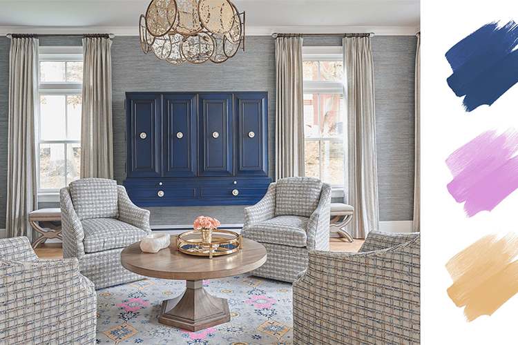
Monochromatic: A monochromatic color scheme involves using different shades and tints of the same color. This creates a cohesive and calming effect, perfect for a minimalist design or a sophisticated look. For example, using different shades of blue, from light sky blue to deep navy, can create a relaxing and serene atmosphere.
Analogous: Analogous color schemes involve using colors that are next to each other on the color wheel. This creates a harmonious and calming effect, as the colors naturally blend together. For example, using shades of orange, yellow, and green can create a warm and inviting feeling.
Complementary: Complementary colors are opposite each other on the color wheel, creating a bold and striking effect. This type of color scheme is often used for high-contrast designs, as the colors create a vibrant and energetic atmosphere. For example, pairing purple with yellow can create a bold and attention-grabbing look.
Triadic: A triadic color scheme involves using three colors that are evenly spaced apart on the color wheel. This creates a vibrant and balanced effect, perfect for a playful and energetic design. For example, using shades of red, yellow, and blue can create a bold and fun look.
Neutral: Neutral color schemes involve using shades of white, black, gray, and beige. These colors create a clean and sophisticated look, perfect for minimalist designs or professional settings. For example, pairing black and white with shades of gray can create a classic and timeless look.
Pastel: Pastel color schemes involve using soft, muted colors, often with a hint of white mixed in. These colors create a delicate and calming effect, perfect for a feminine or romantic design. For example, using shades of pastel pink, blue, and green can create a sweet and whimsical look.

Warm and Cool: This color scheme involves using warm colors, such as reds, oranges, and yellows, in combination with cool colors, such as blues, greens, and purples. This creates a balanced and dynamic effect, perfect for creating a sense of energy and movement. For example, pairing a warm orange with a cool blue can create a bold and attention-grabbing look.
Bright and Bold: This color scheme involves using bright, saturated colors, such as hot pink, electric blue, and neon green. This creates a fun and playful effect, perfect for creating a sense of excitement and enthusiasm. For example, using a combination of bright pink, yellow, and orange can create a cheerful and upbeat design.
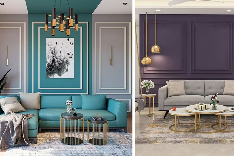
Dark and Moody: This color scheme involves using deep, dark colors, such as navy blue, forest green, and burgundy. This creates a dramatic and mysterious effect, perfect for creating a sense of depth and complexity. For example, using a combination of dark purple, green, and black can create a moody and sophisticated design.
Retro and Vintage: This color scheme involves using colors that are commonly associated with a specific time period or style, such as the 1960s or Art Deco. This creates a nostalgic and retro effect, perfect for creating a sense of vintage charm and elegance. For example, using a combination of mustard yellow, avocado green, and burnt orange can create a retro and funky design.
Earthy and Natural: This color scheme involves using colors that are commonly found in nature, such as earthy browns, greens, and blues. This creates a calming and grounding effect, perfect for creating a sense of tranquility and relaxation. For example, using a combination of olive green, deep blue, and warm brown can create a natural and rustic design.
Metallic and Shimmering: This color scheme involves using metallic and shimmering colors, such as silver, gold, and bronze. This creates a luxurious and glamorous effect, perfect for creating a sense of sophistication and elegance. For example, using a combination of gold, black, and white can create a high-end and chic design.
Gradient and Ombre: This color scheme involves using a gradual transition of colors, either from light to dark or from one color to another. This creates a dynamic and fluid effect, perfect for creating a sense of movement and depth. For example, using a gradient of blues and purples can create a dreamy and ethereal design.
High Contrast: This color scheme involves using colors with a high level of contrast, such as black and white or red and green. This creates a bold and dramatic effect, perfect for creating a sense of impact and intensity. For example, using a combination of black, white, and bright red can create a bold and striking design.
Pop Art: This color scheme involves using bright and bold colors, often in combination with thick outlines and comic book-style graphics. This creates a playful and whimsical effect, perfect for creating a sense of fun and energy. For example, using a combination of bright yellow, red, and blue can create a fun and lively design.
Monochromatic: This color scheme involves using different shades and tints of the same color. This creates a harmonious and cohesive effect, perfect for creating a sense of unity and balance. For example, using different shades of blue can create a calming and serene design.
Pastel: This color scheme involves using soft and muted colors, such as pastel pinks, greens, and blues. This creates a gentle and delicate effect, perfect for creating a sense of innocence and sweetness. For example, using a combination of pastel yellow, pink, and blue can create a soft and romantic design.
Analogous: This color scheme involves using colors that are adjacent to each other on the color wheel, such as red, orange, and yellow. This creates a subtle and soothing effect, perfect for creating a sense of harmony and balance. For example, using a combination of yellow, orange, and red can create a warm and inviting design.
Complementary: This color scheme involves using colors that are opposite each other on the color wheel, such as red and green or blue and orange. This creates a vibrant and energetic effect, perfect for creating a sense of contrast and excitement. For example, using a combination of purple and yellow can create a bold and eye-catching design.
Black and White: This color scheme involves using just black and white, or black, white, and one accent color. This creates a classic and timeless effect, perfect for creating a sense of sophistication and elegance. For example, using black, white, and gold can create a chic and modern design.
Remember, when choosing a color scheme, it’s important to consider the purpose and context of your design. By carefully selecting the right colors, you can create a design that not only looks visually stunning but also effectively communicates your message and resonates with your audience.